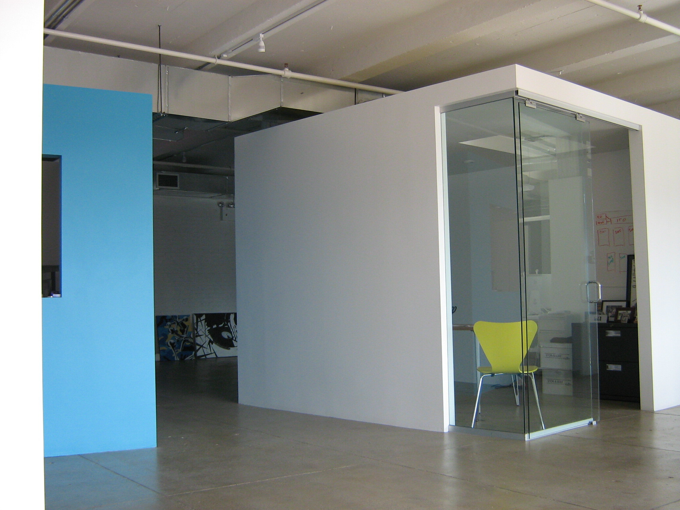
Ito Partnership
ITO PARTNERSHIP
Principals of the startup marketing firm wanted a contemporary, minimalist space to represent its edgy and rebellious philosophy. It was important to give staff as much light and openness as possible with direct access to windows and a roof deck, and to reinforce the company hierarchy by providing the organization’s leaders with private, distinctive space.
Design and construction was achieved within a 4 month period. The space was not prepared by landlord at the time of construction. Windigo worked directly with the General Contractor to identify budget control opportunities, critical path schedule requirements, and cost effective design strategies. Owner directed program changes were accommodated throughout the design and construction process.
A floating central “box” containing private offices for the company’s principals, is juxtaposed at an angle to the building’s structural grid, (much like Broadway in relation to Manhattan’s street grid) creating spaces where century old columns interplay with contemporary walls and ceilings of plaster and glass. By setting the box at an oblique angle near the the middle of the room, it not only speaks of the hierarchy within the company’s organization, but also defines spaces around it for staffing and open collaboration areas. With the exception of the cyan wall (Ito brand color) at the snack bar, the majority of the space is white, giving its occupants the impression of a clean canvas whereupon they can create, pin-up and collaborate. This aesthetic fit well with the client’s mandate that the space have a contemporary, abstract feel.


